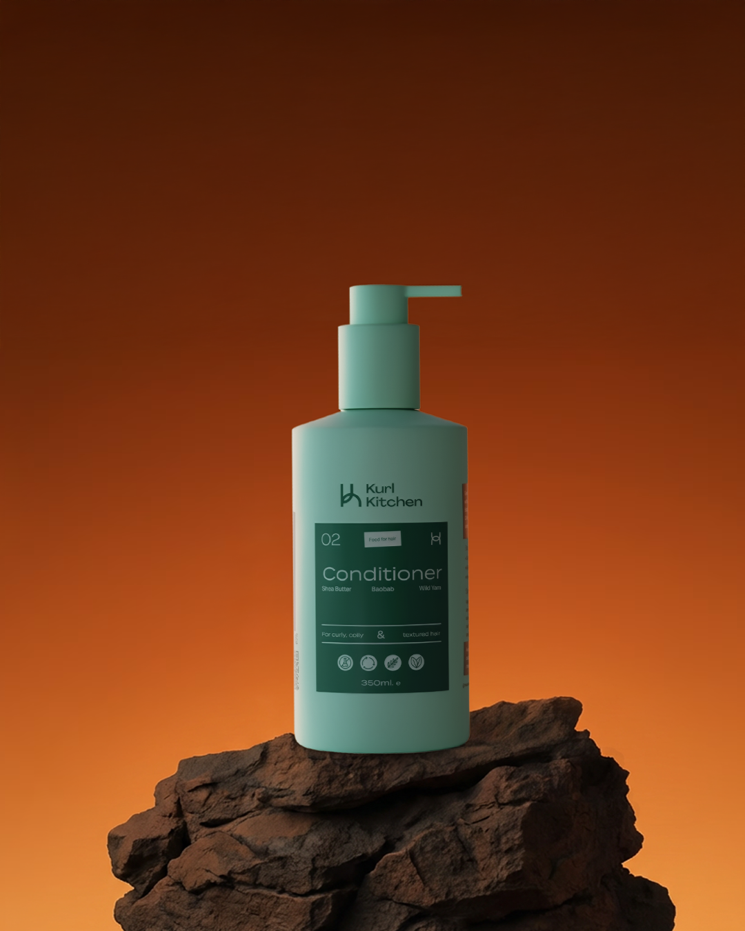
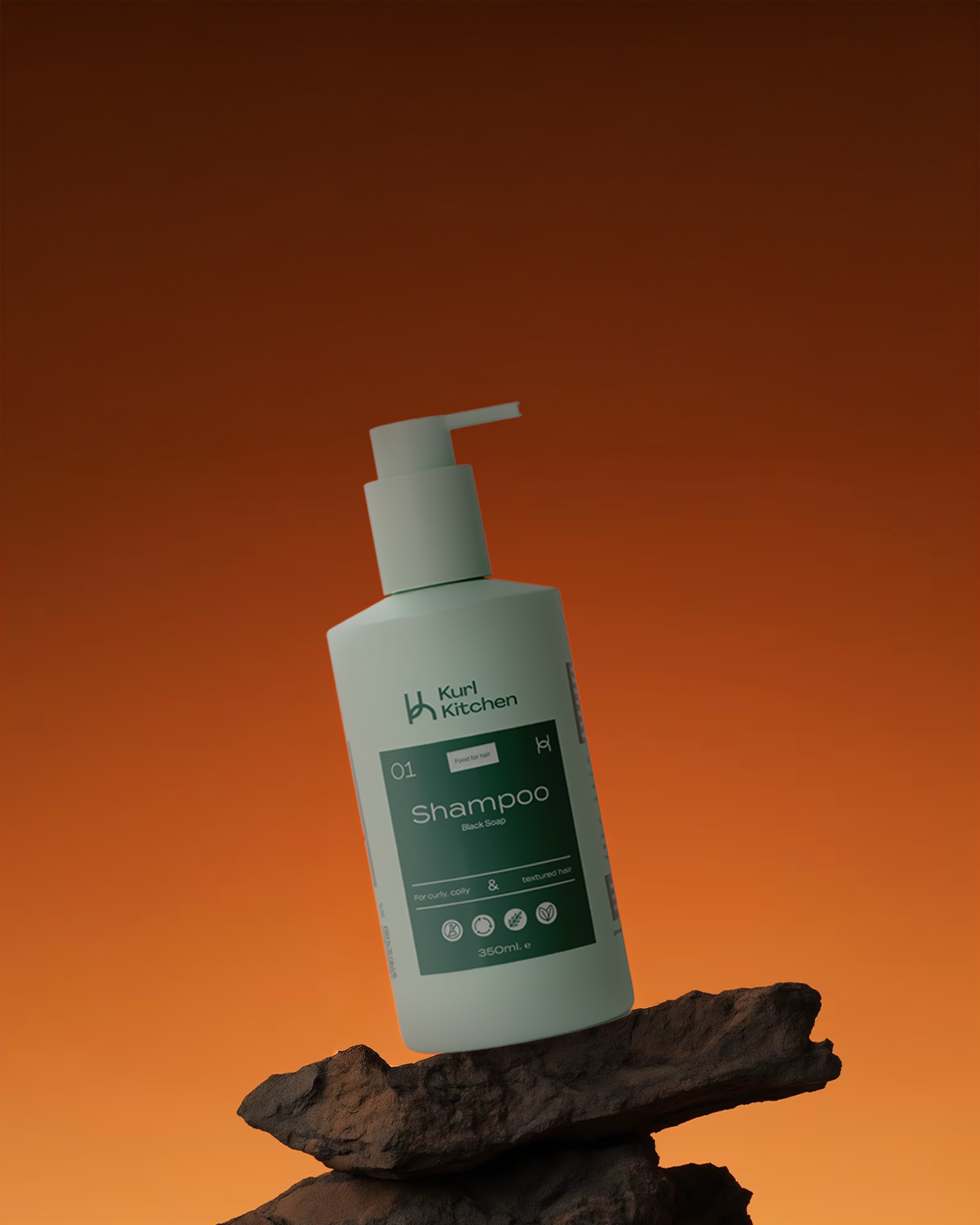
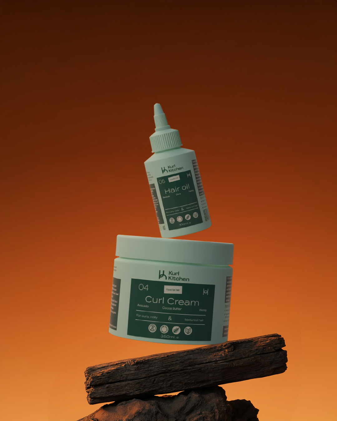
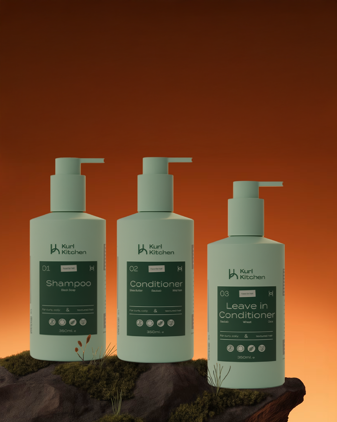
For The Kurl Kitchen bottle designs, our process focused on translating the brand’s established identity into a cohesive and elevated packaging system.
We worked within the existing visual language to refine the bottle designs. The muted green palette and natural material references reinforce the brand’s connection to clean, ingredient-driven hair care, while clear label hierarchy and numbering guide customers seamlessly through each step of their routine. Thoughtful typography and iconography were used to maintain clarity and warmth, ensuring the products feel both modern and approachable.