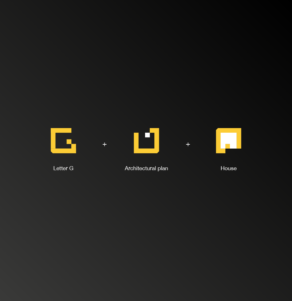
Groundworks is a forward-thinking construction company built on the principles of precision, durability, and trust. The logo design merges three core ideas: the bold letter G, the clean lines of an architectural plan, and the silhouette of a house, symbolizing both the company’s foundational work and the end result they help create.
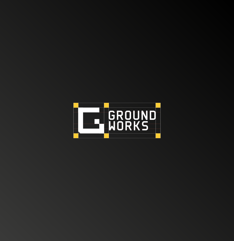
The mark uses strong geometric shapes to convey stability and reliability, with a layout inspired by the structure of technical drawings. The yellow colour is a nod to construction machinery, while the black-and-white contrast adds a sense of professionalism and timelessness.
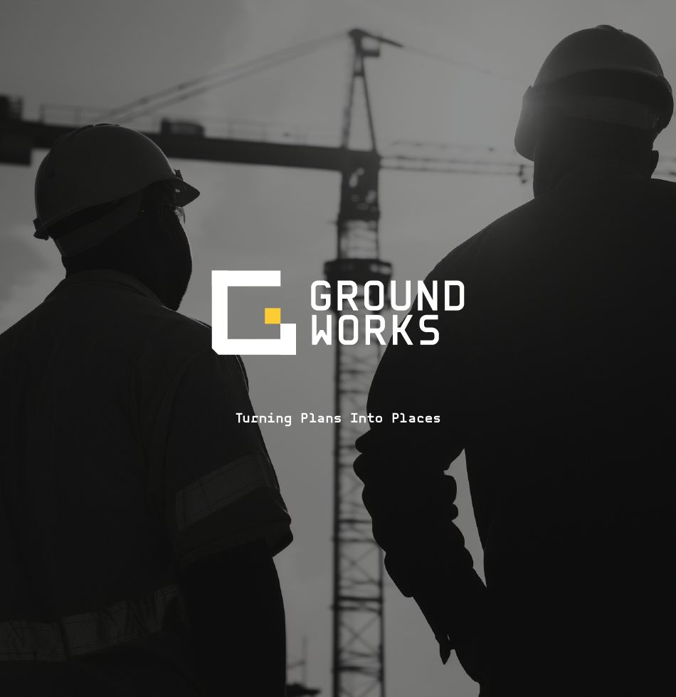
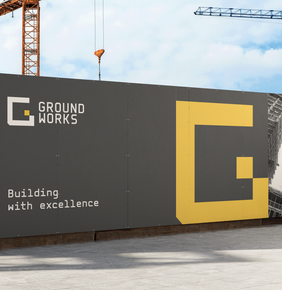
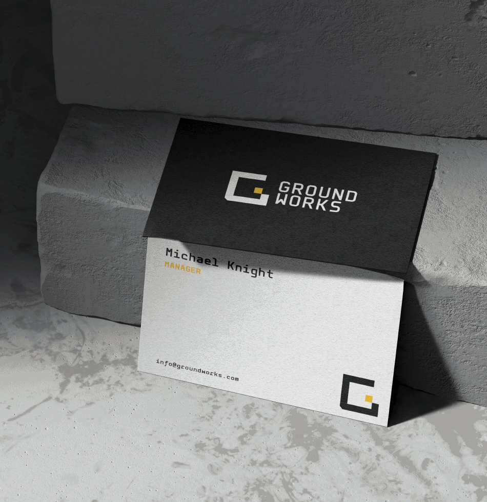
This identity system was designed for versatility, scaling effectively on multiple applications, ensuring Groundworks presents a cohesive, modern, and trustworthy image across all touch points.
ClientGroundworks ConstructionsServicesBrand Identity / Logo Design